Ergodox coding layer layout

I’ve previously written about the Ergodox EZ and the difficulty of where to place all those pesky right-pinky keys that don’t fit, and how to make those symbols (many of which are frequently used for coding) convenient to access.

Before jumping into my solution, let’s review other popular ideas:

  • ZSA’s default Ergodox layout has square brackets on the bottom row of the base layer, and various parens/brackets on the left middle and index columns on a “symbols” layer. The symbols layer is activated with the pinkies. = is in heaps of places: top-right of the base layer, and in layer 1 next to the layer 1 toggles.
  • BEAKL 15 places various bracket-like symbols on the AltGr layer, using the ring and index fingers of both hands. = is on the right middle finger, home row. The AltGr key is on the right thumb.

My solution is a coding layer:

diagram of right-hand key assignments on an ergodox keyboard

The left thumb’s space key acts as a layer modifier for the coding layer while held. The coding layer adds a shift modifier to all the numbers (except 9 and 0, which become square brackets instead of parentheses), and also changes the right hand to have the following layout (where ()=⏎ are the home positions):

&*[]⌫
0{}\/
()=⏎-
!":>+

I think this works better for modern programming languages (C, C++, Java, Javascript, Python, Ruby, Swift) than the ZSA and BEAKL layouts. It optimizes frequent bigrams and trigrams by making them rollable without releasing the layer modifier. For example, ␣{⏎ is a single-direction roll, as are ():⏎ (think Python!), ␣=> (think Javascript arrow functions), ({, }), )⏎ and }⏎. The frequent trigram ␣=␣, while not a continuous roll, is all on home-positions. The layout also complements Dvorak’s left hand symbols: );⏎ can be timed as one stroke.

Subtly, these placements are meant to feel familiar to Dvorak users. I have short pinkies, so I type [0] on Dvorak by moving my whole hand slightly then hitting middle-index-ring with a single stroke; the same can be done with this layout. Similarly, I hit = on Dvorak with my ring finger; it’s still the same finger, but the home-row placement reflects the high frequency of “ = ” in code. Having \ and on the right pinky should also feel very familiar.

I think the layer modifier is also better placed (on the thumb rather than the pinkies) compared to ZSA’s layouts. This leaves all the other left hand fingers in relatively comfortable positions, and space is already covered by the right thumb. I take advantage of this by using the left-hand home positions for modifier keys.

diagram showing an ergodox keyboard layout for the left hand

Of course, my typing preferences aren’t the same as everyone else. This layout is certainly not “balanced” (it’s biased to typing characters with the right hand), and it really emphasizes the efficiency of strokes and rolls rather than penalizing finger movement. It doesn’t perform amazingly with conventional BEAKL penalties.

You can check out my QMK branch from github for the source code, or download the compiled firmware directly (it’s Oryx-compatible!).

Edit 2020-10-28: this is actually v2 of the coding layer, this post previously described a slightly different layout.

Make control-h backspace in TextMate

In macOS, ^h (AKA control + h or ctrl h) will usually delete backward one character, i.e. do the same thing as backspace or what Apple labels delete on its keyboards. Therefore it’s somewhat disconcerting that ^h in TextMate runs “Documentation for Word” or similar “Documentation for Current Word” actions.

Here’s how to disable the default control-h behaviour in TextMate 2.0, and get backspace behaviour instead.

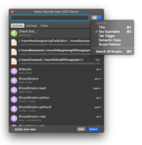
From the menu bar, click Bundles > Select Bundle Item.

screenshot of TextMate Select Bundle Item dialog

From the gear menu in the “Select Bundle Item” dialog, select “Key Equivalent”.

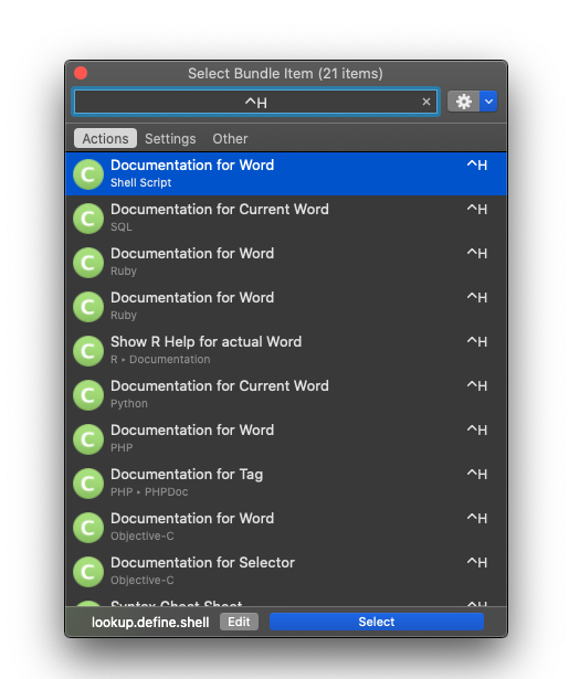
TextMate Select Bundle Item dialog searching for ^h key equivalent

In the search box, press ^h.

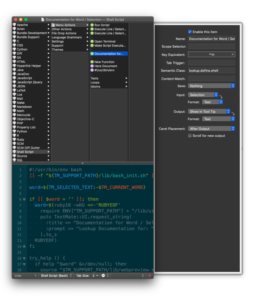
Then for each of the matching documentation actions (there may be several from different bundles), click “edit” then clear the “Key equivalent” field in the side drawer. Close the bundles window and save.

screenshot of the TextMate bundle editor

Repeat the previous step for any other bundles that define a documentation action for ^h.

WordPress GCS plugin broken thumbnails

The GCS plugin for WordPress lets you use Google Cloud Storage for WordPress’s media and other uploads. This is required on stateless environments like App Engine, where there’s no persistent writable filesystem to store uploads.

However, image thumbnailing and rescaling is broken by default when using the plugin, so while you can upload an image, the thumbnails that usually get automatically generated will never appear in the GCS bucket. So if you add high-resolution images to a post, load times will be massively increased, which is a particularly bad experience for low-resolution mobile devices.

I raised a WordPress ticket and attached a patch that fixes the issue. The patch needs to be applied to the core WordPress installation (rather than being a plugin), so may not be an option for WordPress admins that are using multisite hosting. I think a plugin-based fix would be possible (one that replaced the default image editor with a fixed one), but would involve duplicating a bunch of code from core WordPress.

Continue reading “WordPress GCS plugin broken thumbnails”