Updating R output width after resizing the terminal and at startup

By default, R wraps or truncates its output at 80 columns, making it difficult to read data frames with many columns or with long text values. With a modern computer it’s quite likely your terminal emulator or console is significantly wider than 80 columns.

One apparent solution is:

options(setWidthOnResize = TRUE)

Unfortunately, this only takes effect after resizing the terminal, and not at startup. The R documentation suggests setting the initial width from the COLUMNS environment variable:

cols <- Sys.getenv("COLUMNS")
if(nzchar(cols)) options(width = as.integer(cols))

However, at the time ~/.Rprofile is evaluated, COLUMNS is surprisingly empty for me! My guess is that GNU readline initializes it sometime after startup. To work around this, on POSIX platforms we can use the stty command to query the terminal dimensions:

% /bin/stty size
68 128

So the eventual snippet in my ~/.Rprofile is:

# Set output width from terminal width.
if (interactive() && nzchar(Sys.getenv("TERM"))) local({
  # Needs modern readline and R to work.
  options(setWidthOnResize = TRUE)
  columns <- Sys.getenv("COLUMNS")
  if (nzchar(columns)) {
    options(width = as.integer(columns))
  } else {
    # weirdly, COLUMNS is usually empty at startup, so run a child process.
    tryCatch({
      size <- system2("/bin/stty", "size", stdout = TRUE)
      width <- as.integer(strsplit(size, " ")[[1]])[2]
      options(width = width)
    }, error = function(e) e )
  }
})
Duplicating ggplot axis labels

Update: the lemon package’s facet_rep_wrap gives the user control over repeated facet labels (thanks to Flore for pointing it out).

I’ve been trying for a while to find an elegant solution for duplicating axis ticks and labels in a ggplot chart. Hadley replied on the ggplot2 mailing list, but a working solution within ggplot2 seems a way off.

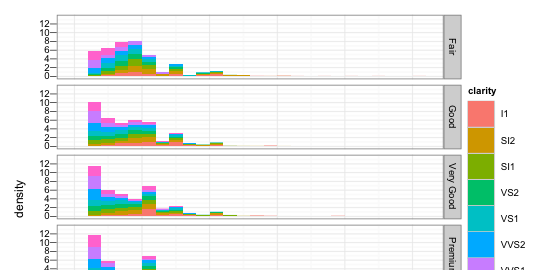
The situation is this: imagine you have a faceted plot that is tall enough that the x-axis ticks and labels become obscured (e.g. when using a clipped viewport such as a browser window). This is particularly destructive when you’re using an x-scale with manual breaks or a transformation.

library(ggplot2)
g <- ggplot(diamonds, aes(carat, ..density..)) + 
   geom_histogram(aes(fill = clarity), binwidth = 0.2) + 
   facet_grid(cut ~ .)
print(g)

Faceted Plot where the x-axis labels have been clipped out

There simply isn’t a way to repeat the x-axis labels in ggplot2 at the moment without discarding faceting and rendering each facet as a separate ggplot call. I’ve seen some examples of selective plotting used to good effect in combining multiple plots with common elements, but I can’t find anything applicable to keep consistent scales and binning without duplicating a lot of the (internal) facet and bin logic.

Continue reading “Duplicating ggplot axis labels”

R and LaTeX PDF graphics

When writing a document in LaTeX that makes use of figures from R, I want to produce a PDF with

  • vector graphics,
  • consistent fonts,
  • not to mess around overlaying text in LaTeX,

and maybe typeset math in the R graphics. This post surveys the state of the art in how to achieve the best of all worlds when importing graphics generated by R into documents typeset to PDF with LaTeX. I look at postscript and PDF figures generated by R’s X11, Cairo, and finally the new (and awesome) TikZ devices.

Continue reading “R and LaTeX PDF graphics”