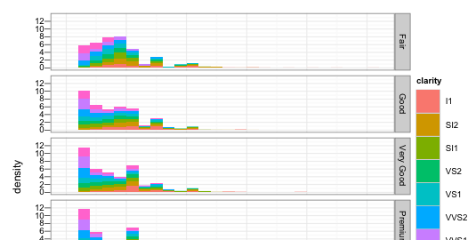
Update: the lemon package’s facet_rep_wrap gives the user control over repeated facet labels (thanks to Flore for pointing it out).
I’ve been trying for a while to find an elegant solution for duplicating axis ticks and labels in a ggplot chart. Hadley replied on the ggplot2 mailing list, but a working solution within ggplot2 seems a way off.
The situation is this: imagine you have a faceted plot that is tall enough that the x-axis ticks and labels become obscured (e.g. when using a clipped viewport such as a browser window). This is particularly destructive when you’re using an x-scale with manual breaks or a transformation.
library(ggplot2)
g <- ggplot(diamonds, aes(carat, ..density..)) +
   geom_histogram(aes(fill = clarity), binwidth = 0.2) +
   facet_grid(cut ~ .)
print(g)

There simply isn’t a way to repeat the x-axis labels in ggplot2 at the moment without discarding faceting and rendering each facet as a separate ggplot call. I’ve seen some examples of selective plotting used to good effect in combining multiple plots with common elements, but I can’t find anything applicable to keep consistent scales and binning without duplicating a lot of the (internal) facet and bin logic.