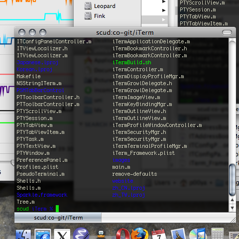
I’ve been a fan of terminal transparency since there have been terminal-emulators that supported it (although in the old days, it was just showing the X11 root window with some tinting). I’m not alone, and similar terminal-emulator users have been ahead of their time with respect to the transparency-fetish that is now popular.
Back on Windows 2k and xp there were various hacks that could turn a window transparent (I used one that came with my nVidia drivers). They weren’t perfect, as the transparency included the window borders and chrome, but they granted real transparency: where the background is a composition of alpha-blended windows. This added a little bit of depth to the desktop, rather than just having pretty terminal backgrounds.
When I moved to OS X, iTerm did it properly (i.e. without making the UI parts transparent). However, at the end of a long night hacking, with several accumulated editor and terminal windows full of text merged on top of each other, there is a serious readability problem with low opacities.
I use transparency because:
- It’s easier on the eyes than high-contrast text-on-black.
- It’s multiplexing content from multiple windows without consuming screen resolution. This is a fidelity trade-off: as the visibility of lower layers of text increases, the accuity of the frontmost (focused) layer decreases.
- It impresses others.
When I saw Vista’s glass effect, the first thing I thought was “finally the answer to stacking translucent terminals!”. Combining blurring with transparency preserves the accuity of the focused window while transmitting enough information to be useful. So you won’t be able to transcribe text from below, but you can see if there’s, say, a burst of activity in IRC.
I suspect Microsoft got some IP rights on it, because Leopard has the most subtle application of transparency+blurring ever (in sheets and the menu bar), compared to Aero’s egregious UI-glassing. However, the imporant thing is that the new Core Image filters can be applied to windows, with a compositing mode that is perfect for terminals (and text editors for that matter).
One stumbling block is that the API to apply window filters is undocumented. Fortunately, thanks to the CGSInternal headers some of this API has been exposed.
It’s already been exploited for Apple’s Terminal.app, but that requires Input Manager patching hacks. I gave reasons why I prefer iTerm in my last post, but here’s another one: it’s open source and so I can add blurring in myself.
Update: check out the source at github, or the built binary.
Update: The patch has been merged into upstream CVS. Yay!
Hi,
Cool use of CGSInternal! Thanks for sharing it.
I notice in your dock that you are using Adium. If you’re feeling up to the task, a user has requested the same blurring for transparent windows. Here’s the ticket: http://trac.adiumx.com/ticket/10253
Cheers,
Ryan Govostes
Alacatia Labs, Inc.